(Source IMPawards.com)
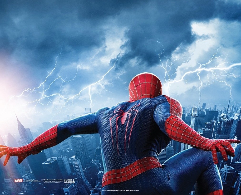
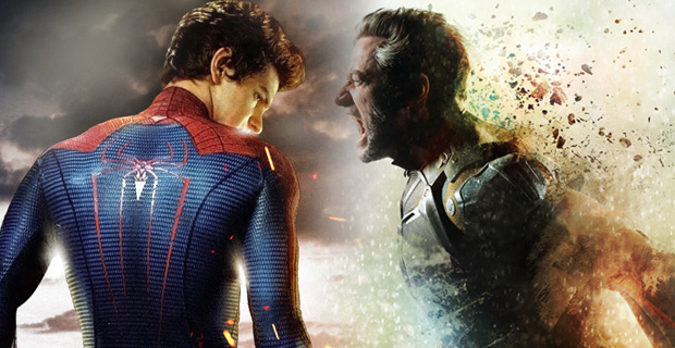
Anyone else just not excited about this poster? They literally just took the first image of Spider-Man, from the first poster and put lightning in the sky in front of him.
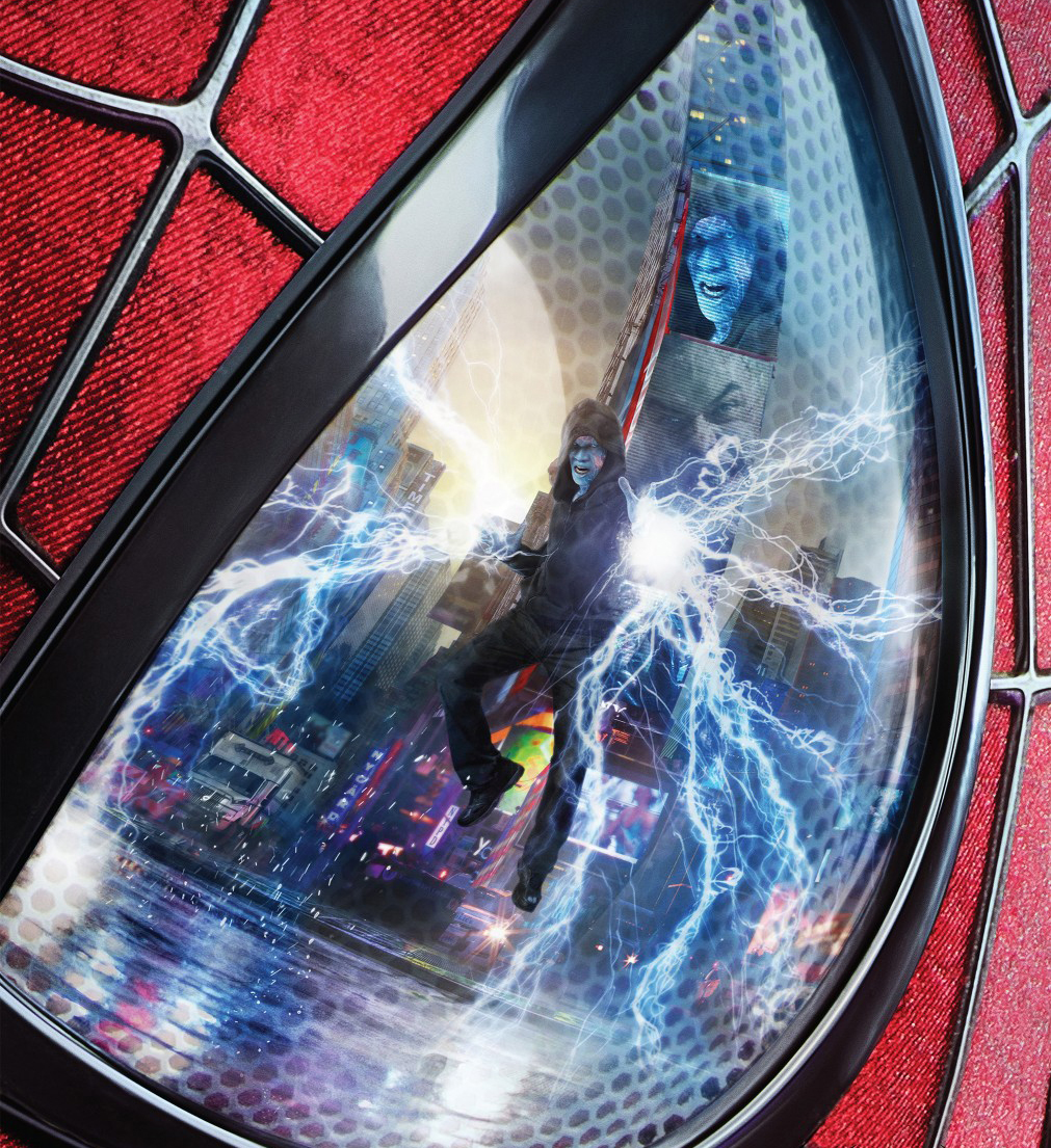
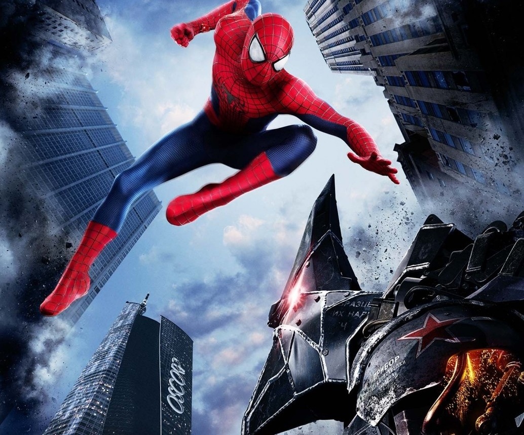
I mean unless they’re going to release 2 more posters that have the other 2 bad guys in the front of spidey then I just don’t know why they bothered making this one. 1 word can sum up what I’m feeling right now: “boo” this is lame. Sorry to say it but its just boring
Am I the only one seriously disappointed with this “teaser” poster for the upcoming sequel?
Let us know what you think below
12/18/2013 – 12:23 am
By James


Be the first to comment on "“Amazing Spider-Man 2” gets a dull new poster"